
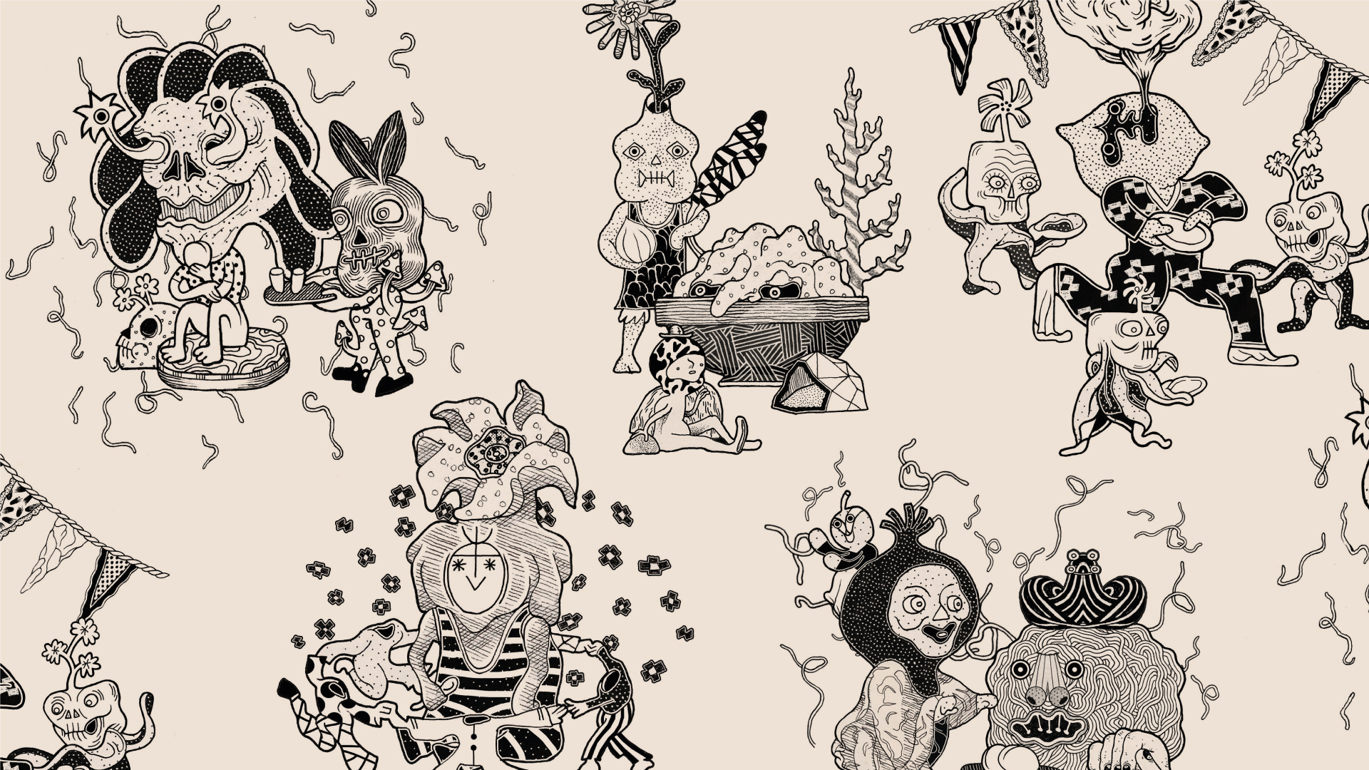
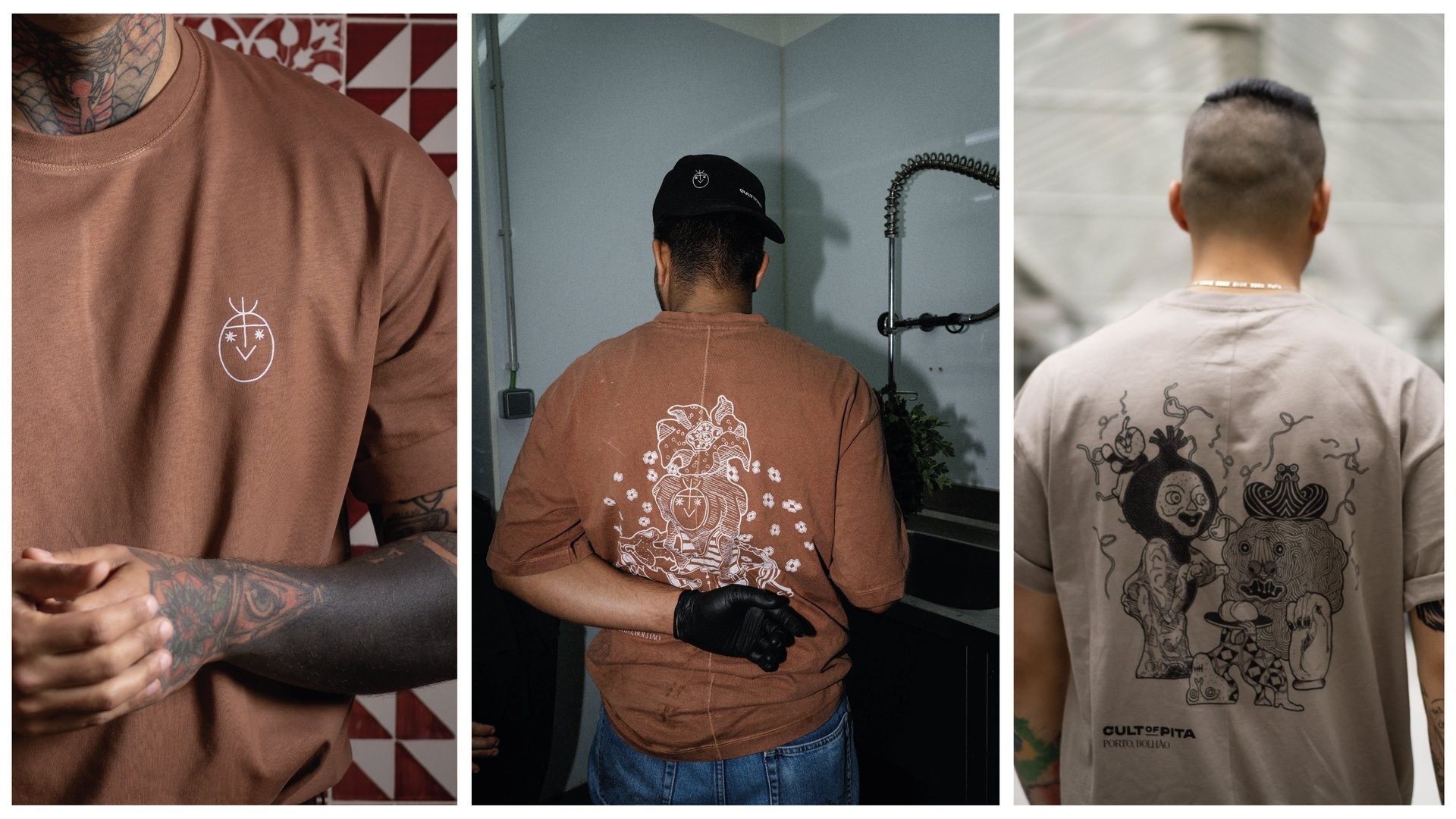
Cult of Pita
Ilustration
2026
A communication concept inspired by the quiet purity of sustainability.
Client
Cult of Pita
Project Info
Fricon set out to develop a new communication approach capable of expressing the brand’s core values while reinforcing its commitment to sustainability. From this starting point emerged the idea that guided the entire rollout: the purity of being sustainable.
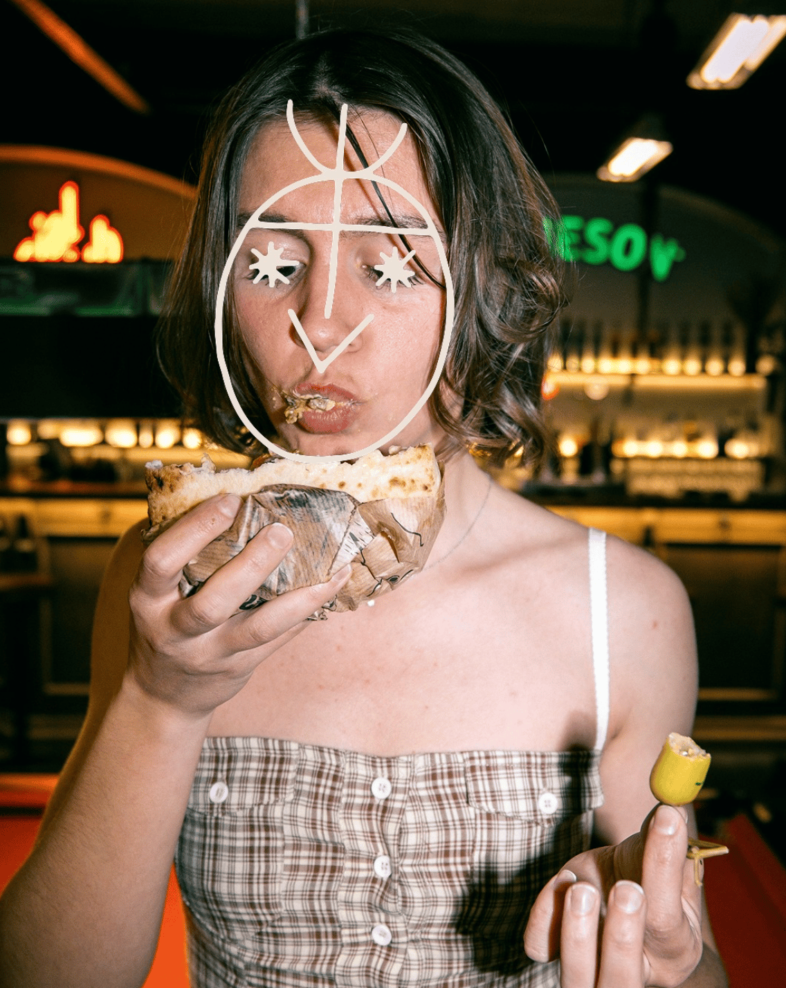
Inspired by nature and guided by white - a colour associated with purity, balance and light - the concept translated Fricon’s sustainable mindset into a clear and distinctive visual language.
White became both symbol and atmosphere, expressing sustainability not only as a feature of the products but as a fundamental principle of the brand’s communication. A proposal built around simplicity, balance and respect for the natural harmony of the planet.

All Rights Reserved

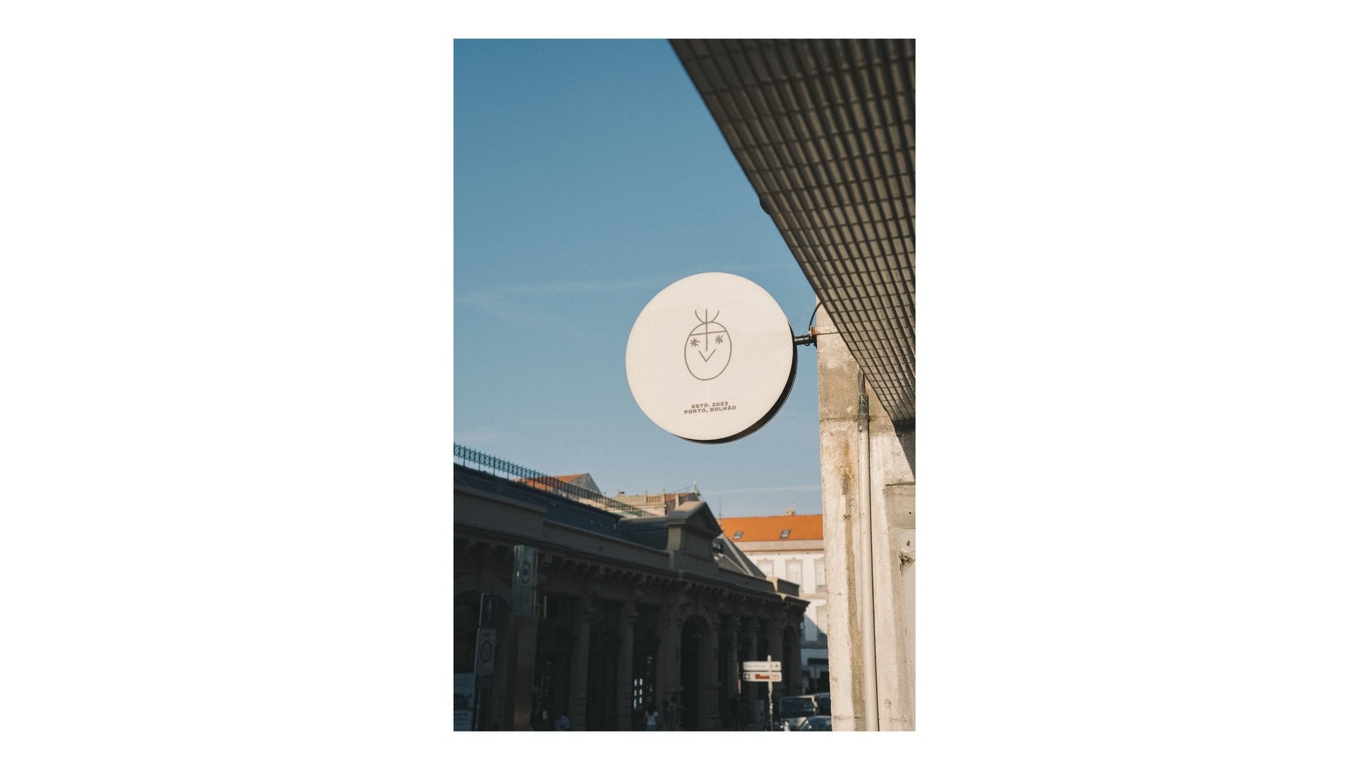
Cult of Pita
Ilustration
2026
A communication concept inspired by the quiet purity of sustainability.
Client
Cult of Pita
Project Info
Fricon set out to develop a new communication approach capable of expressing the brand’s core values while reinforcing its commitment to sustainability. From this starting point emerged the idea that guided the entire rollout: the purity of being sustainable.
Inspired by nature and guided by white - a colour associated with purity, balance and light - the concept translated Fricon’s sustainable mindset into a clear and distinctive visual language.
White became both symbol and atmosphere, expressing sustainability not only as a feature of the products but as a fundamental principle of the brand’s communication. A proposal built around simplicity, balance and respect for the natural harmony of the planet.
If you enjoyed it, you’ll absolutely adore these
All Rights Reserved
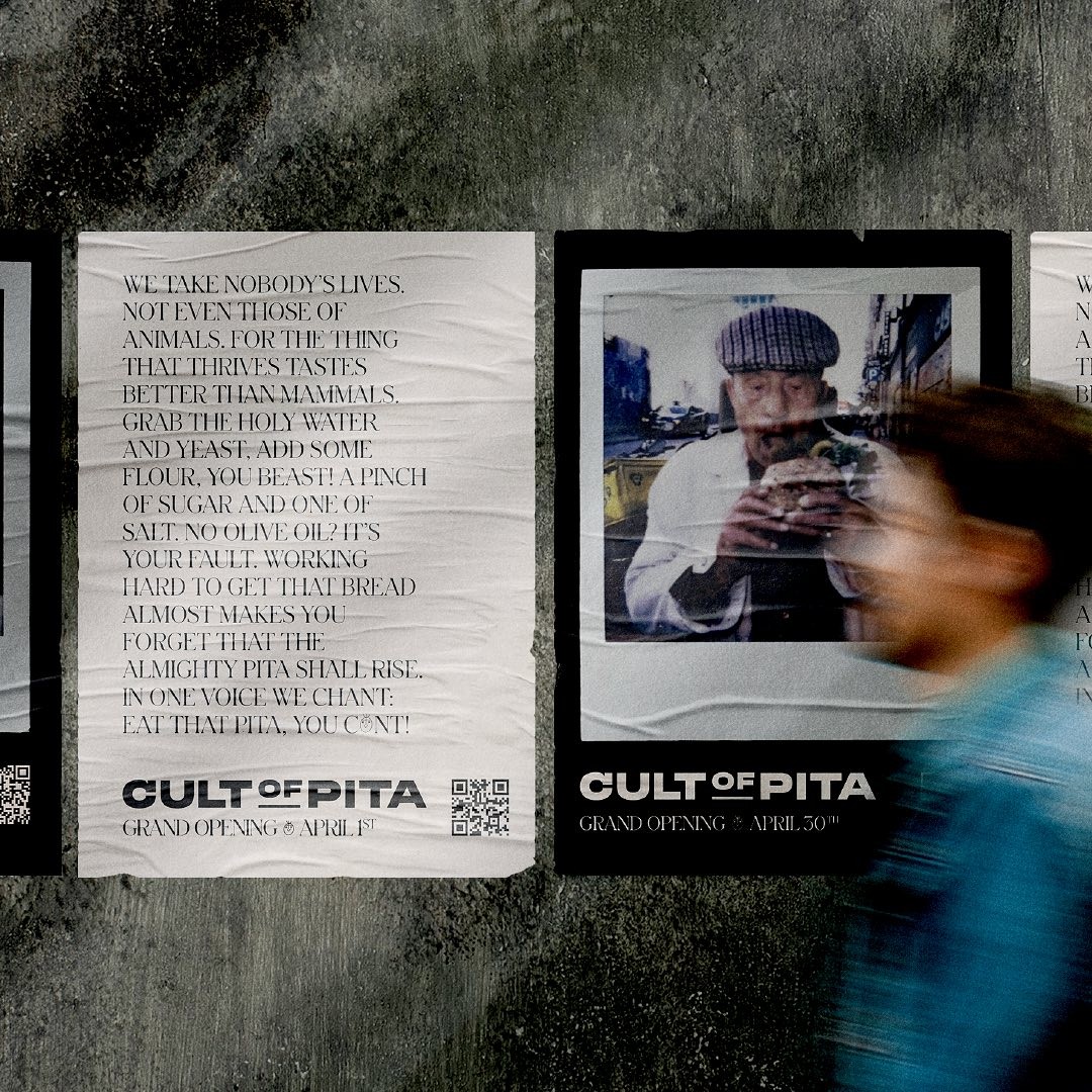
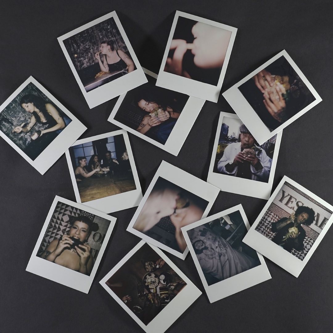
Cult of Pita
Ilustration
2026
A communication concept inspired by the quiet purity of sustainability.
Client
Cult of Pita
Project Info
Fricon set out to develop a new communication approach capable of expressing the brand’s core values while reinforcing its commitment to sustainability. From this starting point emerged the idea that guided the entire rollout: the purity of being sustainable.
Inspired by nature and guided by white - a colour associated with purity, balance and light - the concept translated Fricon’s sustainable mindset into a clear and distinctive visual language.
White became both symbol and atmosphere, expressing sustainability not only as a feature of the products but as a fundamental principle of the brand’s communication. A proposal built around simplicity, balance and respect for the natural harmony of the planet.
If you enjoyed it, you’ll absolutely adore these

All Rights Reserved