
Palacete Severo
Branding
Comunicação 360
2026
An identity guided by the harmony of geometry, heritage and time.
Client
Palacete Severo


Project Info
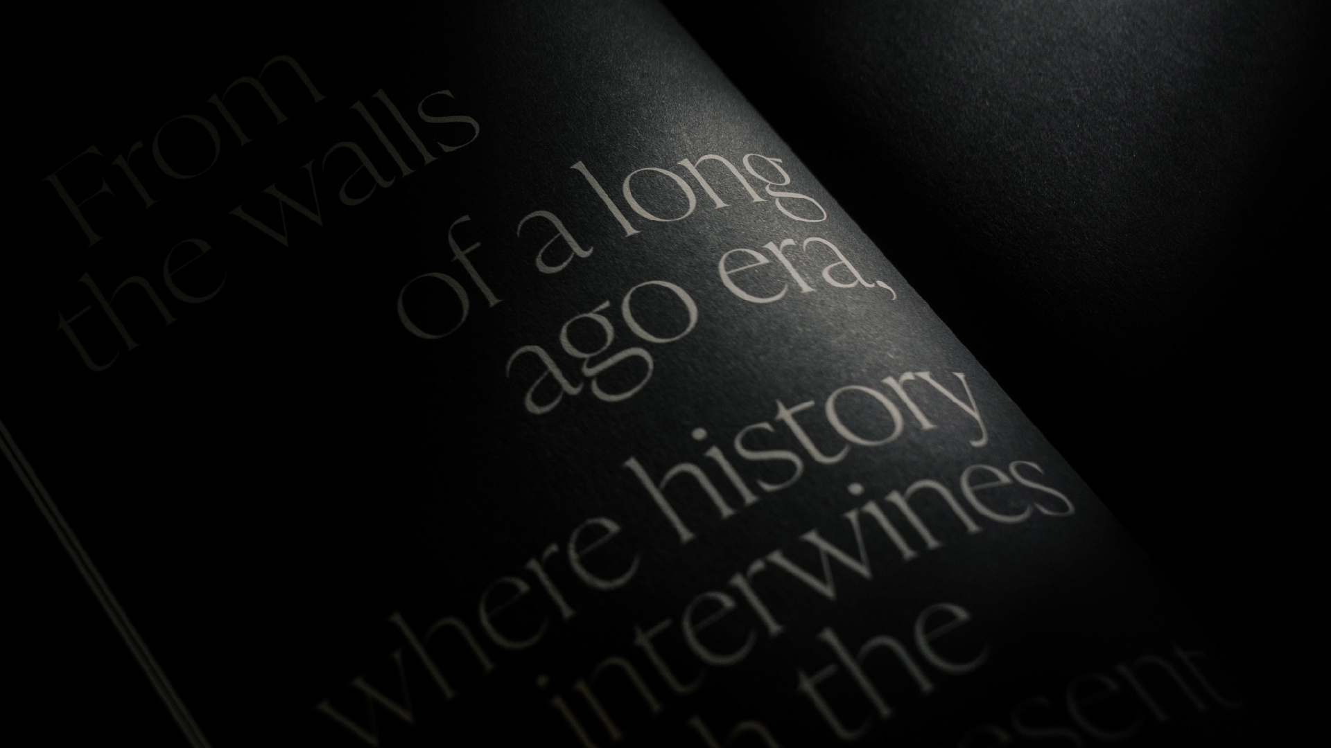
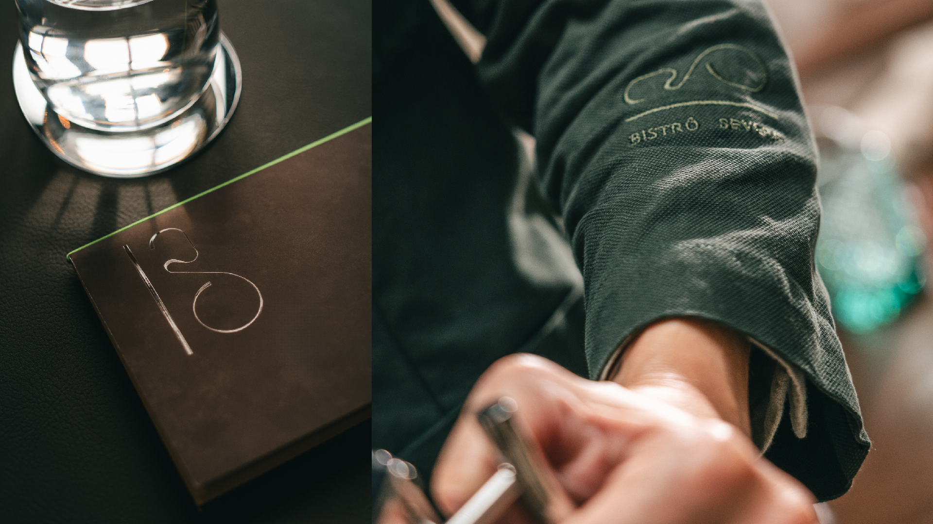
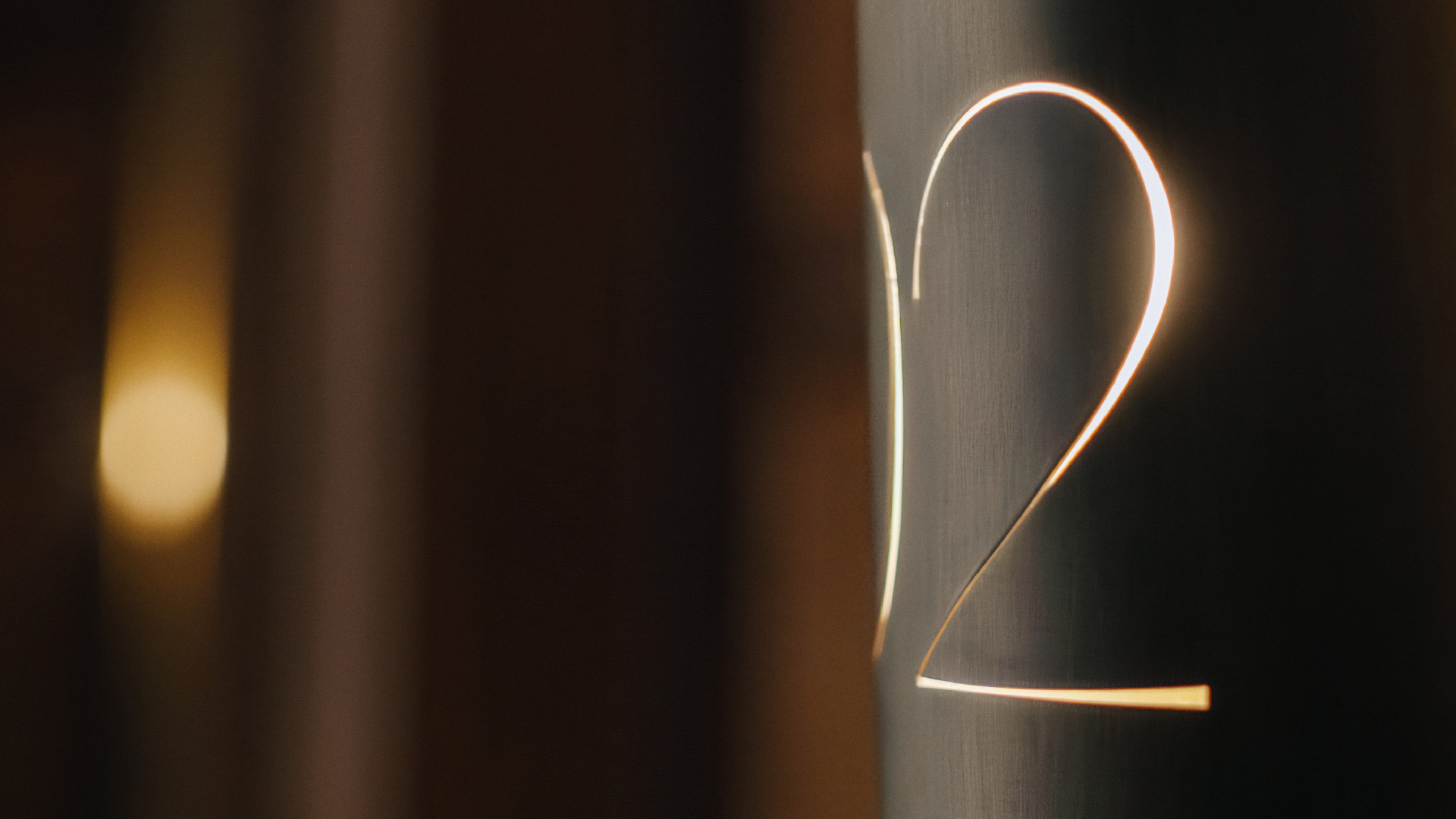
Rebranding Palacete Severo required finding the right balance between its historic legacy and the need for a contemporary visual identity. Inspired by Ricardo Severo’s vision, always ahead of his time without renouncing the past, the concept drew from elements already present in the building and its surroundings.
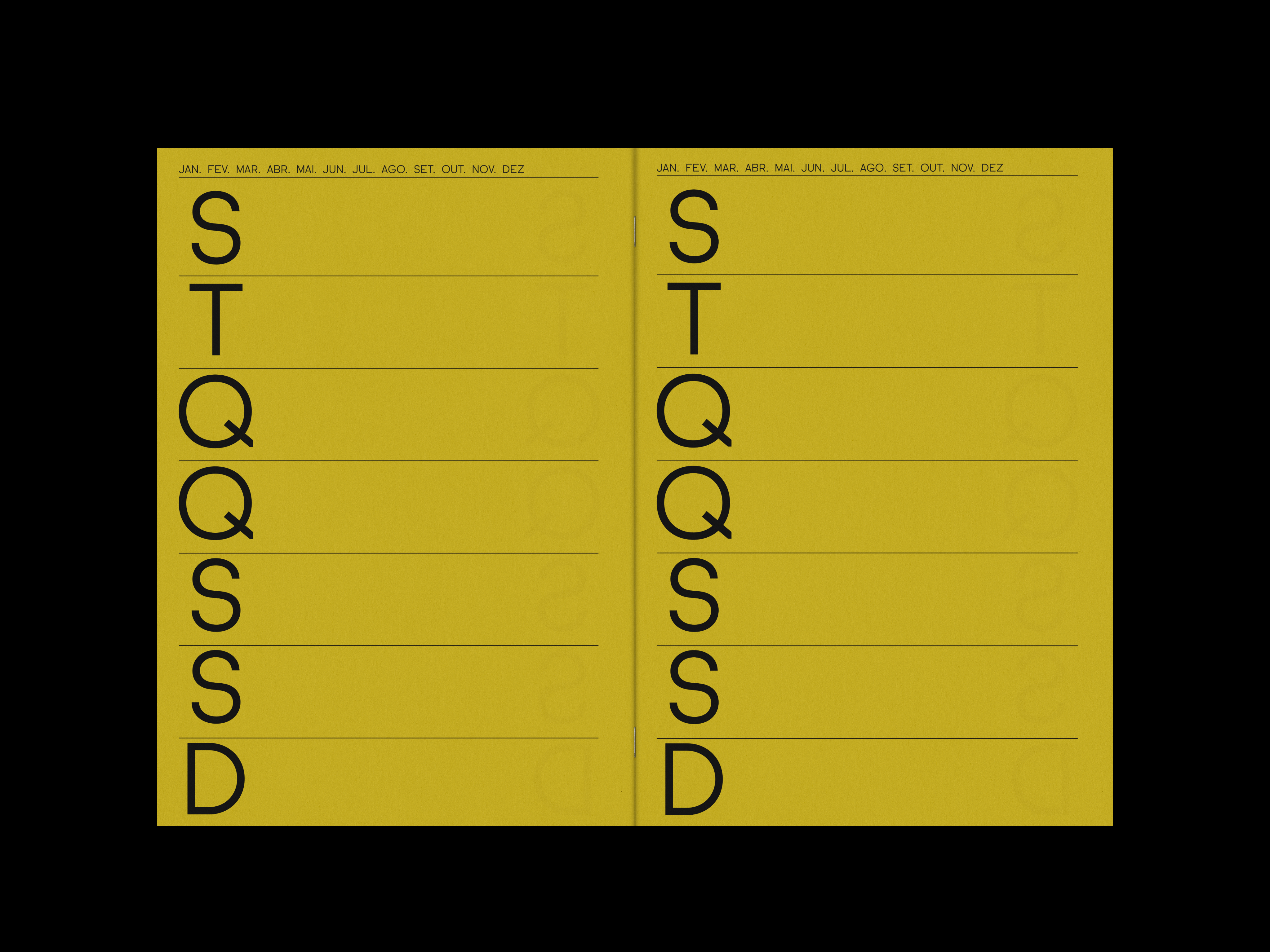
The golden ratio and the Fibonacci spiral, visible in the architecture and in nature around the palacete, became the conceptual foundation of the project. These mathematical principles guided the creation of a visual language where precision, history and modernity coexist in harmony.
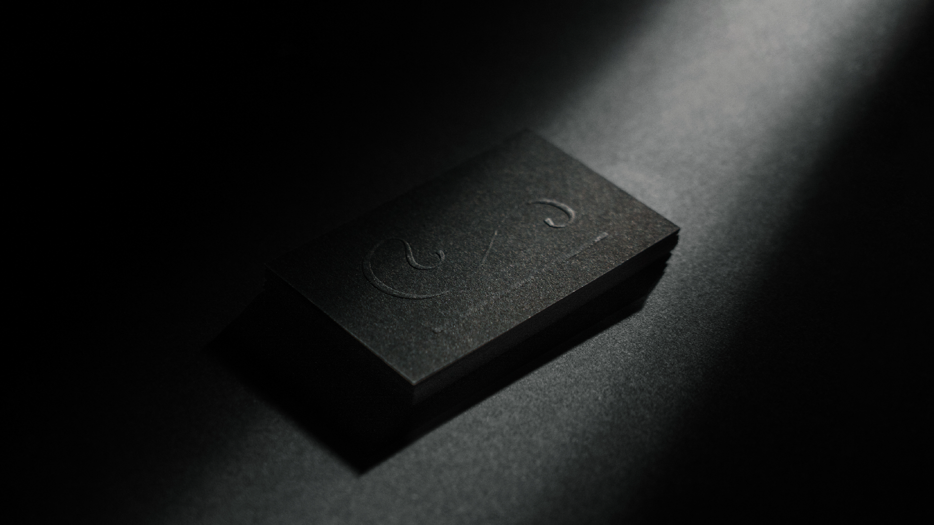
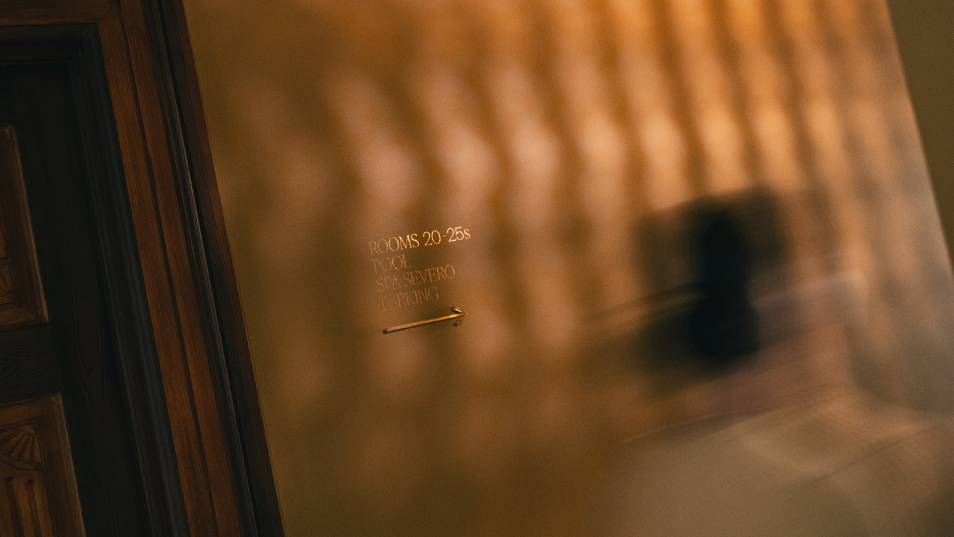
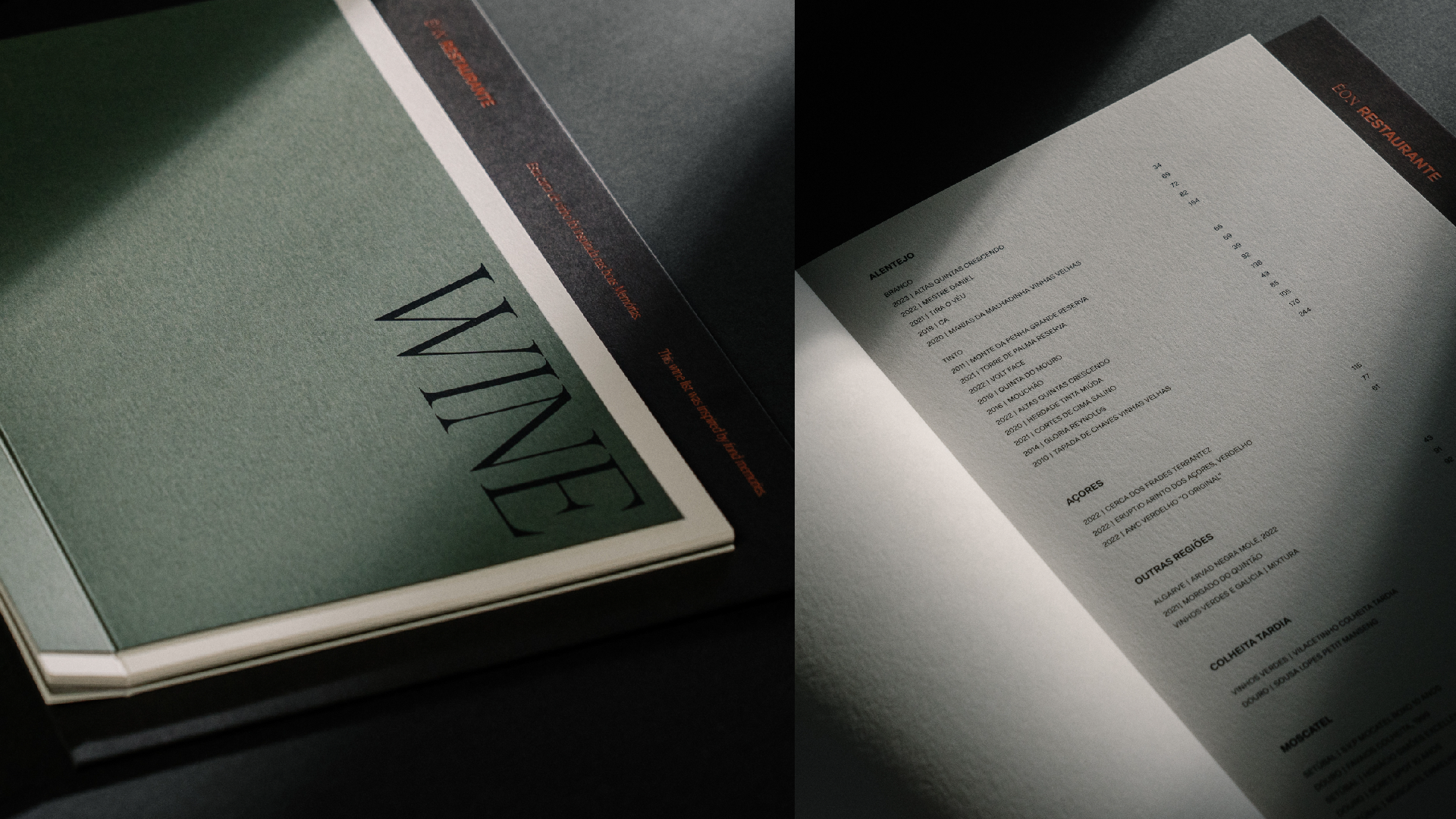
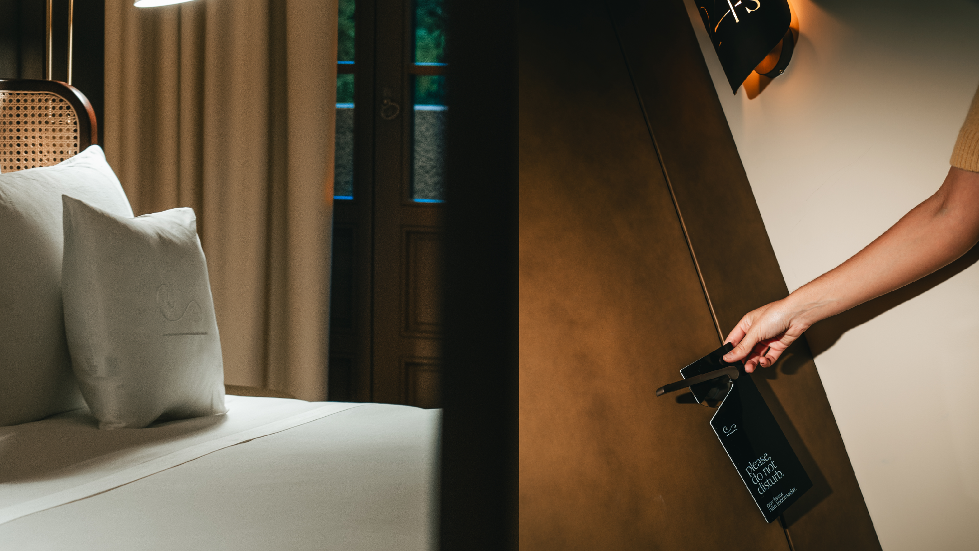
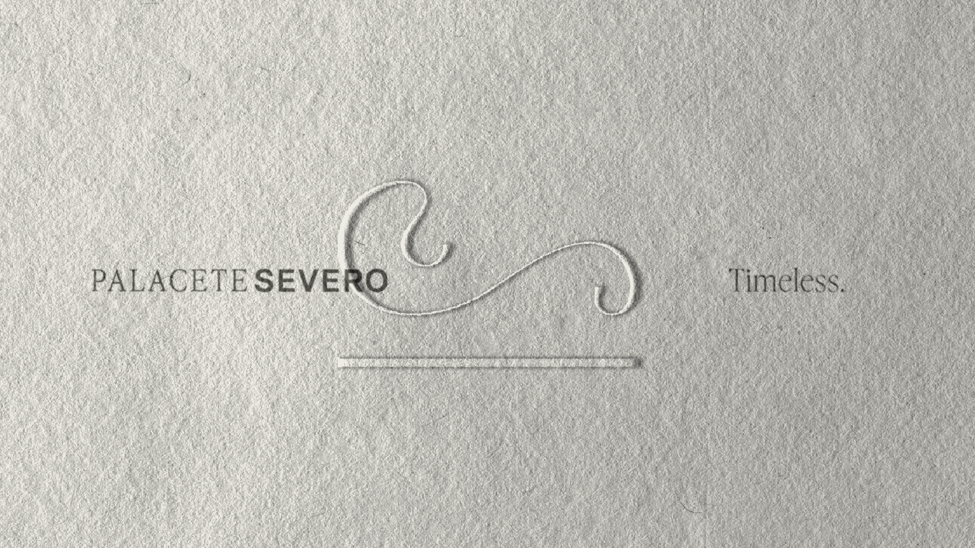
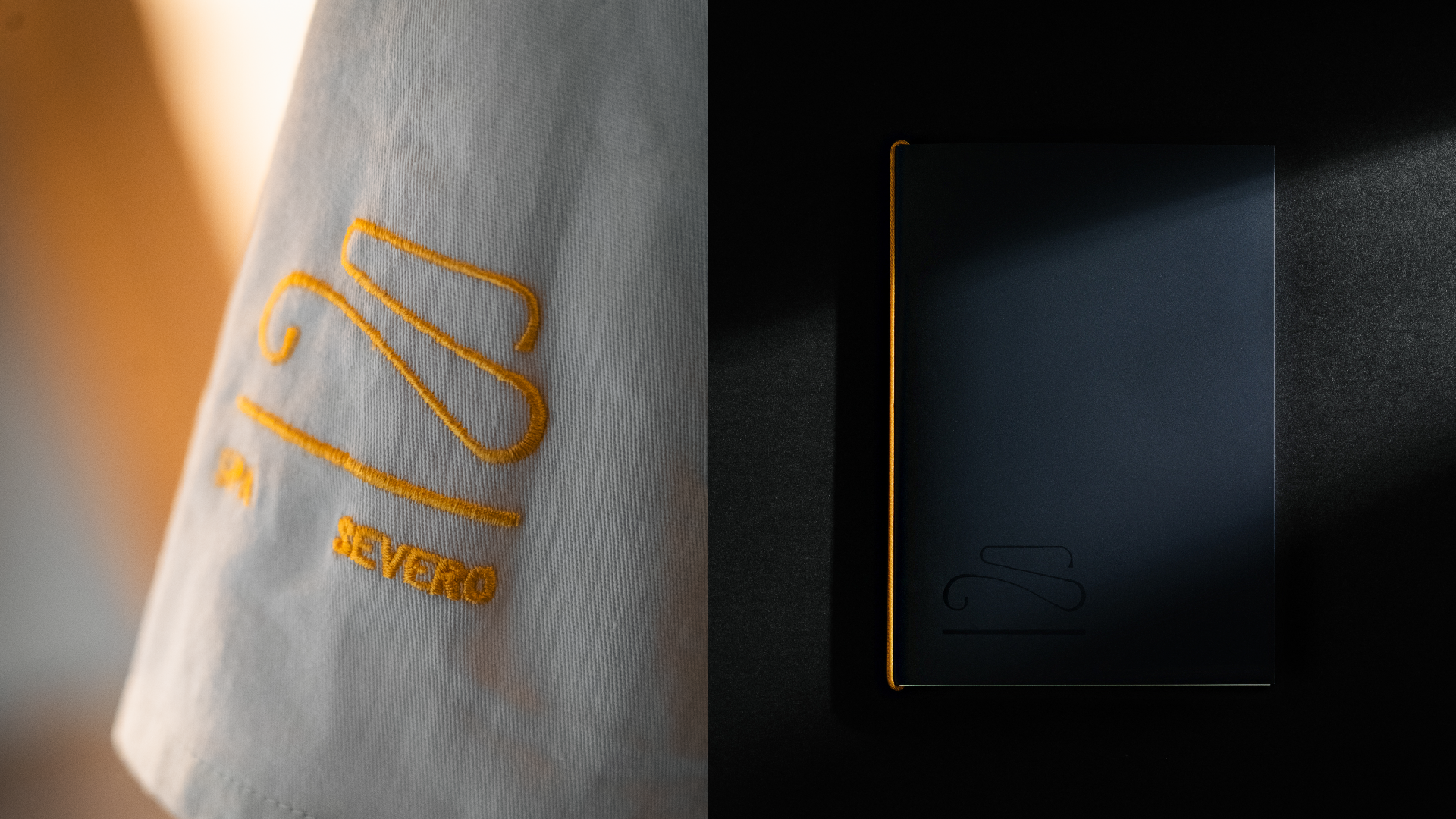
The solution resulted in a refined and symbolic design. The “S” of Severo was abstracted into a distinctive graphic element, supported by a typographic system that balances tradition and innovation. A carefully curated colour palette, together with glyphs and signage, completes a cohesive visual system that honours the legacy of the building while projecting it into the future.

All Rights Reserved

Palacete Severo
Branding
Comunicação 360
2026
An identity guided by the harmony of geometry, heritage and time.
Client
Palacete Severo
Project Info
Rebranding Palacete Severo required finding the right balance between its historic legacy and the need for a contemporary visual identity. Inspired by Ricardo Severo’s vision, always ahead of his time without renouncing the past, the concept drew from elements already present in the building and its surroundings.
The golden ratio and the Fibonacci spiral, visible in the architecture and in nature around the palacete, became the conceptual foundation of the project. These mathematical principles guided the creation of a visual language where precision, history and modernity coexist in harmony.
The solution resulted in a refined and symbolic design. The “S” of Severo was abstracted into a distinctive graphic element, supported by a typographic system that balances tradition and innovation. A carefully curated colour palette, together with glyphs and signage, completes a cohesive visual system that honours the legacy of the building while projecting it into the future.
If you enjoyed it, you’ll absolutely adore these

All Rights Reserved
Palacete Severo
Branding
Comunicação 360
2026
An identity guided by the harmony of geometry, heritage and time.
Client
Palacete Severo
Project Info
Rebranding Palacete Severo required finding the right balance between its historic legacy and the need for a contemporary visual identity. Inspired by Ricardo Severo’s vision, always ahead of his time without renouncing the past, the concept drew from elements already present in the building and its surroundings.
The golden ratio and the Fibonacci spiral, visible in the architecture and in nature around the palacete, became the conceptual foundation of the project. These mathematical principles guided the creation of a visual language where precision, history and modernity coexist in harmony.
The solution resulted in a refined and symbolic design. The “S” of Severo was abstracted into a distinctive graphic element, supported by a typographic system that balances tradition and innovation. A carefully curated colour palette, together with glyphs and signage, completes a cohesive visual system that honours the legacy of the building while projecting it into the future.
If you enjoyed it, you’ll absolutely adore these
All Rights Reserved